Metallic color Label Printing Services for Stunning Branding
Please feel free to contact us.
Metallic color Label Print
Today, we will introduce metallic color label printing.
When you hear "metallic color label," those familiar with printing might imagine "color foil" or "silver ink." Indeed, color foil stamping and custom printing with silver ink can both achieve a metallic effect.
However, there are other methods to achieve a metallic look, as shown below:

As shown in the image above, printing "solid" or "halftone" on glossy silver material can create a metallic seal. Incidentally, the golden material used in label printing is made by printing translucent yellow on silver material, rather than starting with a gold material.
This time, we will introduce the method of expressing metallic colors by printing "solid" and "halftone" on glossy silver material.
What are Solid and Halftone Printing?
"Solid" refers to "full-surface printing," while "halftone" refers to a "screen." These terms indicate the finish of the print based on whether the printed area is solid or halftone.
If this sounds confusing, the explanation of halftone is clarified in the diagram below.
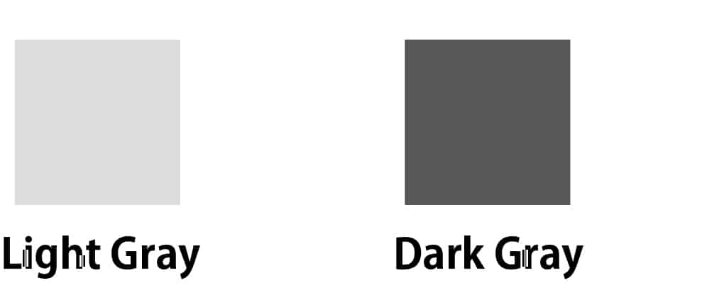
Consider the "print" as shown above. The left gray is light, and the right gray is dark. Let's say these are printed with black ink in halftone rather than gray ink. Here's an explanation (though gray ink printing is also possible, we will explain halftone here).
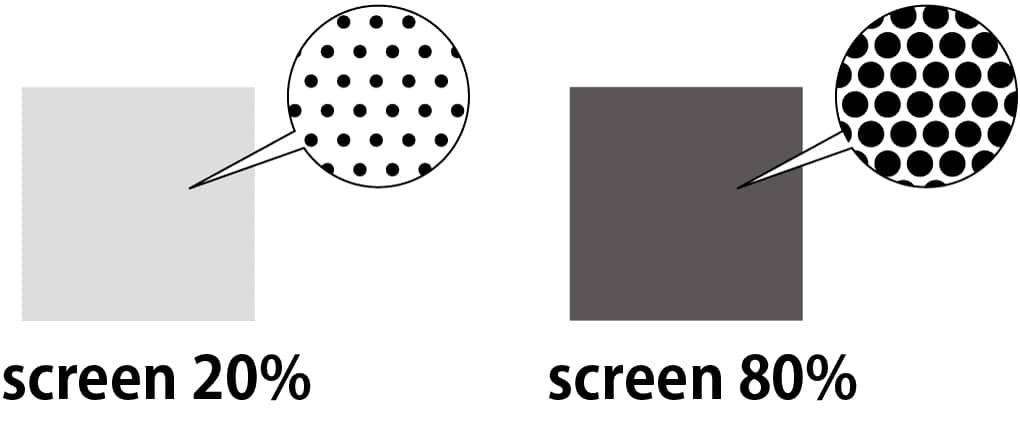
As you can see in the diagram above, halftone refers to "dot size." In other words, when the halftone percentage is low, the dots are small, and there is more white space, making the color appear lighter. Conversely, when the halftone percentage is high, the dots are larger, and there is less white space, making the color appear darker. In printing terminology, "solid" refers to 100%, meaning there is no white space and the entire surface is printed.
Designers familiar with label materials might say, "This gray should be 70% black."
Print Data for Metallic Colors
To print labels, Adobe Illustrator data is first needed. Yes, the so-called "Illustrator data." Here, we created data with halftones ranging from 0 to 100% as follows:
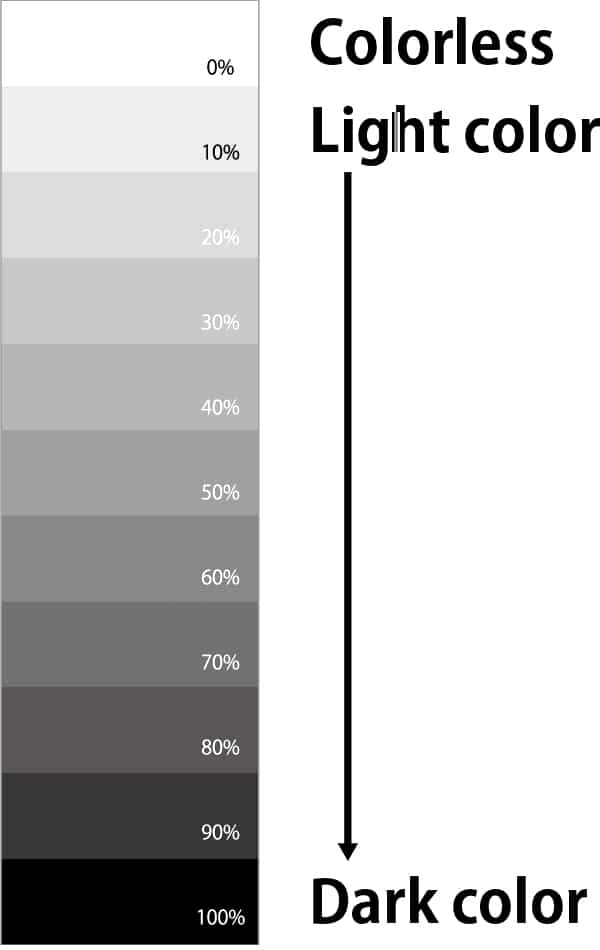
0% means no printing, while the dots gradually increase from 10% to 100%, which is solid. Of course, even with solid 100%, a metallic effect can be achieved. To enhance the metallic effect, lower the halftone percentage to increase the silver area, thus achieving a stronger metallic silver.
This time, let's find out what percentage of halftone is just right.
Materials Used
We selected Lintec's Glossy Silver 50μ (FNS Glossy 50PAT1) as the base material. It's not quite a mirror finish, but it's a glossy silver that can reflect your face. It's often used for industrial labels.
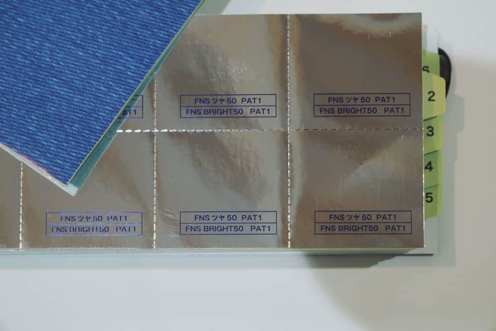
Metallic color Label Printing Condition
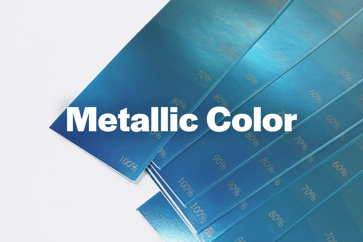
The printing turned out like this. We chose cyan (blue) from the four-color process inks. You can see how the blue gradually becomes darker in stages.
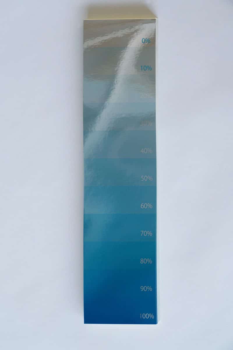
As expected, the blue is faintly visible from 10%, but it appears very light. Upon closer inspection, it seems that from about 50%, the blue metallic effect becomes more pronounced.
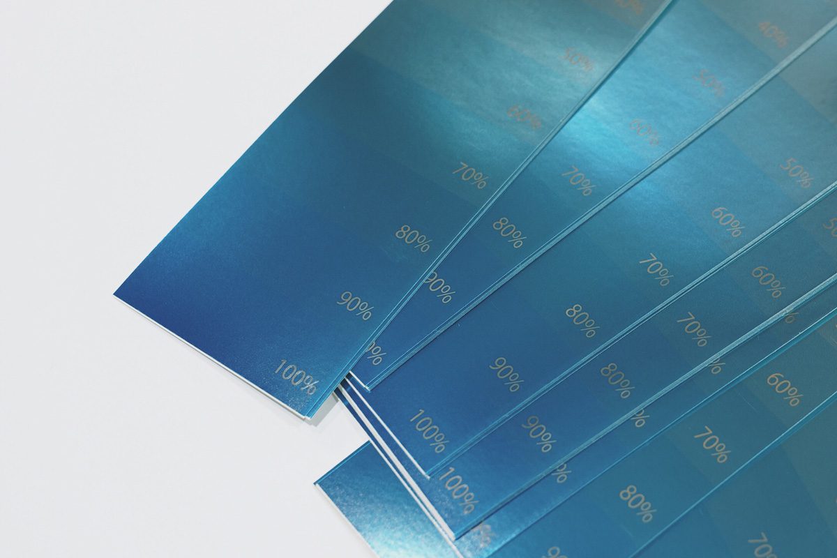
As a result, we recommend using 80% or higher. 10-60% appears too light. Summarizing the color density, it looks like this:
・50%: Too light
・60%: Light
・70%: Slightly blue
・80%: Noticeably blue
・90%: Just right
・100%: Just right
However, note that the color's appearance may vary slightly depending on the hue. Special colors are created by mixing multiple inks. In this process, the transparency of the ink gradually decreases due to the addition of different inks, which increases the opacity. This can block the silver shine, so adjustments to the halftone percentage in the data may be necessary. Therefore, we recommend conducting a color proof in advance when using special colors.
How was the metallic expression using silver? We hope this serves as a hint for your future design creations.
For more detailed inquiries, please contact us below.

Start Your Project Now!
Contact Us or Get a Quote!

