What Is PANTONE? Guide to Color Swatches and Benefits
PANTONE is a globally used color reference guide. It is widely utilized not only in the printing industry but also in fashion, graphic design, textiles, and many other fields.
However, some people may not be familiar with its practical use and benefits. In this article, we will explain the features and strengths of PANTONE, along with specific steps on how to use it.
We are a specialized label and seal printing company that can accommodate not only PANTONE color specifications but also DIC and other color samples whenever possible. If you are considering labels and seals using color samples, please contact us below.
Please feel free to contact us.
TOC
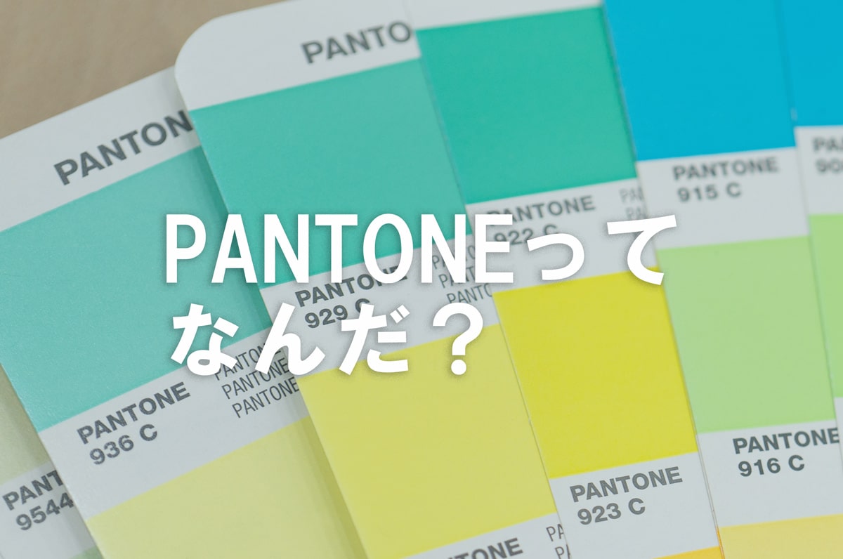
What is PANTONE?
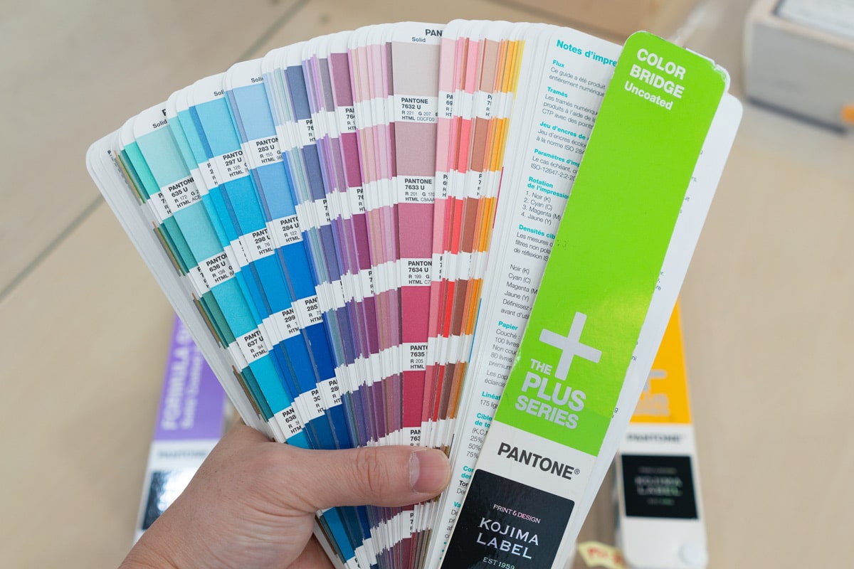
PANTONE is a globally standardized color reference guide developed by the American company PANTONE. Due to its high convenience in reproducing the same color on different printing machines, it has been widely used worldwide.
The color guide assigns a number to each of the thousands of colors, allowing for common color recognition simply by specifying the number. Being an internationally recognized standard, it can be used worldwide with the same numbers.
Today, it is used in a wide range of fields, not only for printed materials but also for web design and the fashion industry, due to the ease of specifying colors.
The Difference Between PANTONE and DIC
DIC is a color reference guide developed by Japan's DIC Corporation and is widely used in the domestic printing industry. Most domestic printing companies can handle DIC, and it is known for its cost performance compared to PANTONE.
However, unlike PANTONE, its international recognition is not high, making it unsuitable for projects shared with overseas companies. Additionally, its color variations are fewer than PANTONE, limiting the choices available.
Despite their pros and cons, both standards are useful tools widely used among stakeholders. Actively use them when interacting with printing companies.
Understanding PANTONE Colors
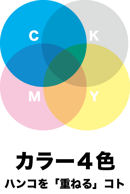
Printed materials are often colored using the CMYK color model, but PANTONE uses a method called "spot colors" to represent colors.
※CMYK stands for
It is a color model used to represent colors on printed materials such as paper. It is called four-color printing as it expresses colors by layering cyan, magenta, yellow, and key plate (black).
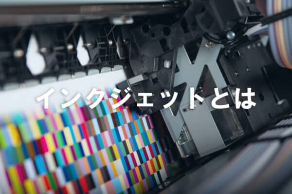
CMYK is the standard color for color printing, whether for home or business use, and is typically adopted by inkjet printers.
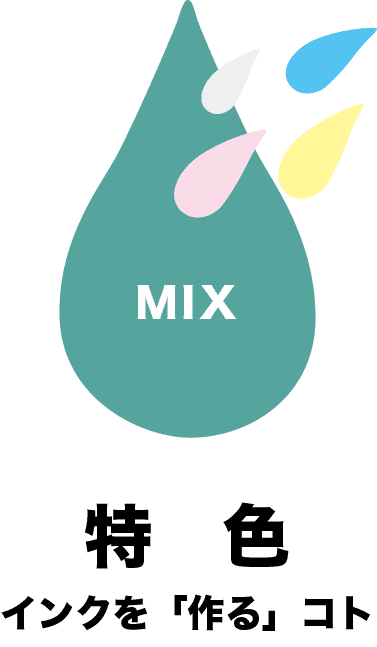
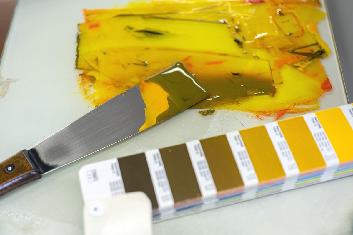
Unlike CMYK, which reproduces colors through a process of overlaying four inks, spot colors use only pre-mixed single-color inks.
Because different inks do not overlap, spot colors are known for their sharp and clear color reproduction.
Steps to Use PANTONE
Here are the steps to use PANTONE.
【Steps to Use PANTONE】
- Confirm whether the printing company supports PANTONE
- Note the color number from the PANTONE color guide
- Specify the color number and place an order for printed materials
Step 1: Confirm Whether the Printing Company Supports PANTONE
If you want to use PANTONE for specifying spot colors, make sure the printing company supports PANTONE. In Japan, some printing companies may only adopt DIC and not accept PANTONE.
Moreover, if you complete the design submission and order process online without specifying, there is a possibility that it will be printed in CMYK four colors. Check during the quotation or inquiry stage, or even before that via phone or email to prevent issues.
Before placing a formal order, it is essential to proceed with the verification process carefully. Since PANTONE occasionally adds new colors, it is recommended to check if the desired number is available. (Although we have many PANTONE samples, there are rare cases where we do not have the specific number you want.)
Step 2: Note the Color Number from the PANTONE Color Guide
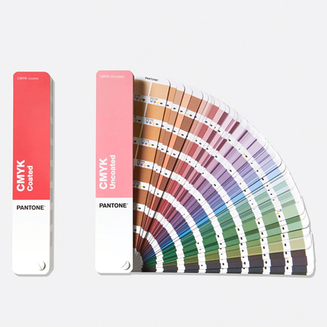
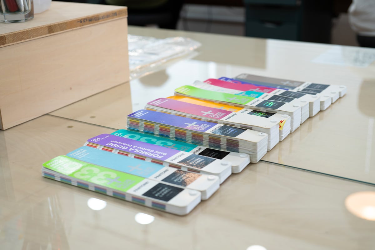
Check the color guide and note the desired color number. Be careful not to make mistakes, as even one incorrect digit will result in a different color.
You can purchase the PANTONE color guide from the official website or Amazon. While there are websites where you can search for color codes online, the same color cannot be reproduced because screens and print use different principles to represent colors.
※RGB and CMYK
・RGB
Refers to the color mechanism adopted for digital screens. Based on the "three primary colors of light," it adjusts the degree of color emission to express various color tones.
・CMYK
Refers to the color mechanism adopted for dyes such as inks. Based on the "three primary colors of dyes," it creates various colors by combining three colors.
When specifying colors, always select them from a physical color guide to ensure the final color matches your expectations. If you do not have a color guide, it is recommended to print out the desired color found online and send it to the printing company.
Indicating colors through physical samples is the most efficient and minimizes misunderstandings. However, note that the color may not match exactly when matching spot colors based on a four-color printed sample.
Step 3: Specify the Color Number and Place an Order
Once you have decided on the color and design, specify the color number and place the order with the printing company. The printing company will mix the ink according to the specified color and reproduce it as directed.
PANTONE Usage Precautions
The precautions for using PANTONE are as follows:
- Cannot be used in on-demand printing
- Color proofing may be required
Precaution 1: Cannot be Used in On-Demand Printing
Basically, PANTONE color specifications cannot be used in on-demand printing.
※On-demand printing refers to
printing directly from data without using plates.
Related article: What is On-Demand Printing? Differences from Offset Printing, Advantages, and Precautions Explained
On-demand printing reproduces data and designs using standard CMYK inks or toners, making it difficult to print with spot color inks.
Difference Between Ink and Toner
- Ink: Liquid printing material
- Toner: Powdered printing material
If you want to specify colors from the PANTONE color guide, you will generally need to choose a printing method that uses plates.
Offset printing and relief printing are typical examples of plate-based printing methods. If you want to know more about offset printing, please refer to the following article.
Note 2: Color Proofing May Be Necessary
Even if you specify the same PANTONE number, the final result may look different depending on the printing material. The ink absorption varies with the paper characteristics, changing the appearance of the same color.
For example, "coated paper (glossy paper)" and "uncoated paper (common paper)" are widely used for printing, but their ink application and color appearance differ. Uncoated paper, which lacks gloss and absorbs ink more easily, tends to make colors look duller. (In the printing industry, this is referred to as the color "sinking.")
If you are particular about color accuracy, paid color proofing is recommended.
※What is Color Proofing?
It is the process of verifying that the intended color can be accurately reproduced before entering formal printing production.
Related article: Color Proofing for Seal Printing | An Important Process to Avoid Color Recognition Issues
While it is a paid process and not mandatory, it is advisable to do it when the loss from unexpected results is significant.
We offer the possibility to proceed with production while checking details from color proofing. If you would like to discuss, please contact us from "Contact Us".
Benefits of Using PANTONE
The benefits of using PANTONE are as follows:
Benefits of Using PANTONE
- High color accuracy and design reproducibility
- Stand out by using spot colors
- Overall cost may be reduced
Benefit 1: High Color Accuracy and Design Reproducibility
Using PANTONE allows for precise color matching, preventing misunderstandings and ensuring smooth communication. Since everyone involved can share the same color reference, it minimizes miscommunication. Also, since single-color ink is mixed before printing, it has less color variation and blotchiness compared to CMYK, which overlays ink during printing.
PANTONE is widely adopted for corporate logos and colors, making it frequently seen in daily life. Its reliability in scenarios where color consistency is crucial is a significant advantage.
Benefit 2: Stand Out by Using Spot Colors
Spot colors can create colors that CMYK cannot, significantly expanding the freedom and range of design expressions. Examples include:
Examples of colors that CMYK cannot create
- Fluorescent colors
- Pastel colors
- Metallic colors, etc.
CMYK becomes darker and more intense with more color layering, making it difficult to express light pastel colors.
Therefore, for vivid bright colors or soft pastel tones, spot colors are recommended. Using colors that standard printing equipment cannot produce can help differentiate your product from competitors.
Benefit 3: Overall Cost May Be Reduced
For printing methods that use plates, such as offset printing or letterpress printing, spot colors can sometimes reduce costs. In the case of CMYK, four plates are required for each color, which increases the cost of creating the plates, even though the ink cost is lower.
On the other hand, spot color printing requires only one plate for one-color printing and two plates for two-color printing, which can reduce the cost of creating plates. Although the ink cost is higher due to the need for mixing, the overall cost may be lower.
If You Seek Consistent Quality and Differentiation, PANTONE is Recommended
PANTONE is a globally standardized color system. Using PANTONE when planning and creating printed materials allows for accurate color specification, ensuring the final product meets your expectations.
Additionally, choosing colors that cannot be produced with standard inks can help differentiate your product from others. If you seek a high-quality finish, consider using PANTONE or spot colors.
We are a specialized label and seal printing company that can accommodate both PANTONE and DIC color specifications. If you do not have a color guide, you can view the actual samples on-site. While color consideration may be charged, it allows for the creation of more accurately reproduced seals. If you seek a meticulous finish, please consult us from the link below.

Start Your Project Now!
Contact Us or Get a Quote!