The Colors of PANTONE Differ from Those on PC Monitors

TOC
About PANTONE Colors Seen on PC Monitors
In conclusion, printed colors will not match the PANTONE colors you see on your PC monitor. This time, we will explain the special color specifications for printing, and the points to note about PANTONE and DIC. We hope this will be helpful for those planning to order printed materials.
What is PANTONE?
PANTONE is the name of a globally used color system and color matching system. A color matching system refers to standards and methods for consistently identifying and reproducing specific colors.
PANTONE was developed in 1963 by PANTONE Inc., an American color communication company.
The main feature of PANTONE is that each color is assigned a unique number (PANTONE color code). The PANTONE color code, represented by a combination of numbers and letters, clearly identifies specific colors. By using this color code, designers and printers can achieve consistent color reproduction across different devices and printing processes.
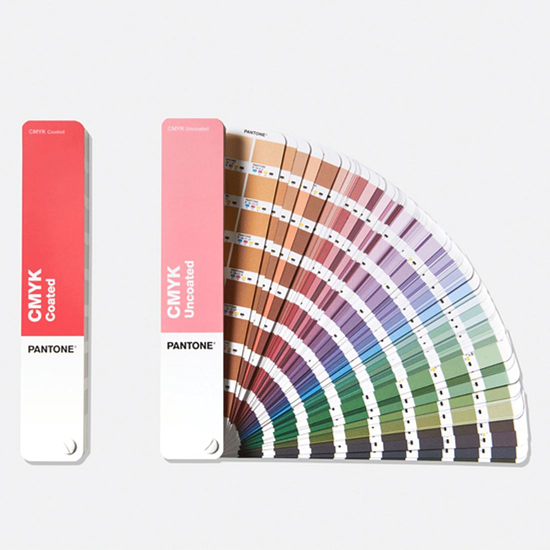
PANTONE offers various products to cater to different uses. PANTONE color guides and color books are tools for referencing specific colors and serve as standards for color matching.
What Is PANTONE? Guide to Color Swatches and Benefits
Why do colors differ between print and PC?
As mentioned earlier, the colors in printing do not match the PANTONE colors displayed on your PC monitor. There are two main reasons for this, which are particularly important for graphic designers and those creating data to understand.
First, monitor colors vary by manufacturer. This difference becomes even more pronounced if the monitor’s color settings have been altered. Additionally, the same data may display differently on Mac and Windows systems.
Second, printing companies create colors based on official color swatches from PANTONE rather than relying on PC monitors.
For these reasons, please consider the PANTONE colors set on your PC as merely indicative or at a nuance level.
Label print colors don't match my home printer
Please feel free to contact us.
How to Specify PANTONE in Illustrator
Unfortunately, the previous PANTONE color library available in Illustrator has been discontinued and is now replaced by the Pantone Connect plugin. There is a free plan available, but it offers limited access to 15,000 colors and other features. The paid plan allows unlimited access to all functionalities, with a monthly subscription costing $14.99 (approximately 2,200 yen) and an annual subscription priced at $89.99 (approximately 13,500 yen). Starting with the free plan might be a good option.
Installation Instructions
You can install the plugin from the following link: Pantone Connect.
To verify that the installation was successful, click on "Manage" in the top right corner of the Pantone Connect page. This will redirect you to the Adobe Creative Cloud page, where you can check if it shows as installed.
Installed Plugin Location
Once installed, you can immediately use it in Illustrator. Using the plugin is straightforward. First, open Illustrator. Then, navigate to Window → Extensions → Pantone Connect to access the plugin.
Considerations When Specifying Colors with PANTONE
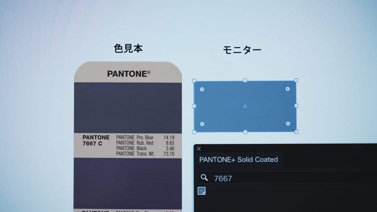
As mentioned above, the colors in the color swatch (left) and on the monitor (right) may vary slightly.
So, what should you do? Set your colors while referring to a physical PANTONE swatch book. However, many may not have a PANTONE swatch book on hand.
If you don’t have one, print out the colors. Adjust the CMYK values until you achieve a color you like, and send this printed swatch to your printing company. This approach of providing color specifications through a physical sample is the most efficient way to ensure clarity in your color targets.
For even greater satisfaction, we recommend conducting a color proofing, which will incur an additional cost.
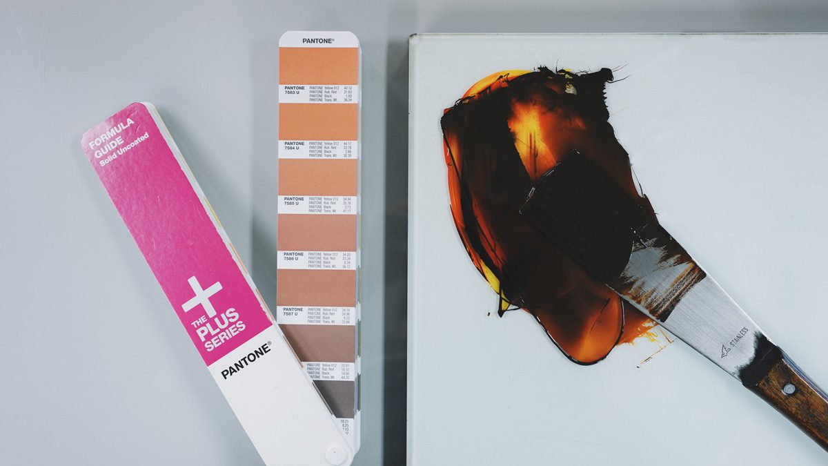
Printing primarily utilizes the CMYK four-color process to represent colors; however, simply adjusting the ink often does not achieve the desired color target. In such cases, adjustments to the CMYK values in the original AI data are necessary, as merely altering the ink will not yield the color you want.
In these situations, it is recommended to specify colors using spot colors like PANTONE or DIC, where the inks are mixed in advance to create the desired color.
Why Use CMYK for Printing: Ensuring Accurate Color Reproduction
Conclusion
When selecting colors, use a PANTONE swatch book or printed color samples instead of relying on your PC monitor. If using printed samples, be sure to send them to your printing company as color references when placing your order.
We hope this serves as a helpful tip for your future design projects.
Related Articles
Sticker Printing Color Proofing: Ensure Accurate Colors

Start Your Project Now!
Contact Us or Get a Quote!